
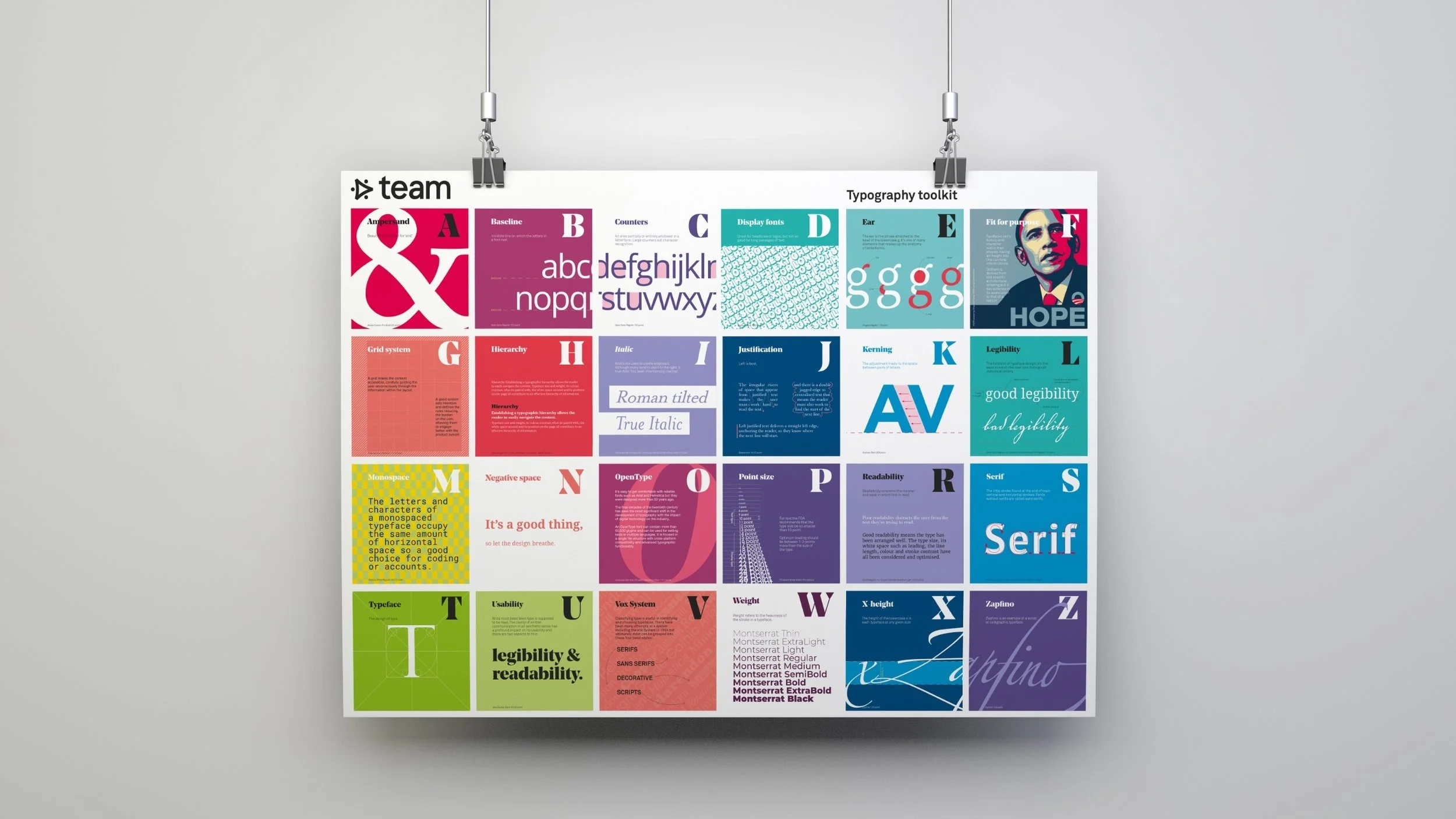
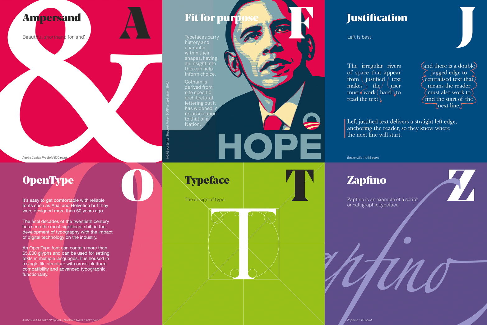
At its most basic level type is supposed to be read; the clarity of the written communication has a profound impact on its usability and there are two key aspects to this: legibility and readability.
Open counters, generous lowercase x-heights and minimal stroke contrast are all qualities of a legible font or rather typeface; they allow the reader to distinguish individual letterforms with ease. But it’s not just about choosing the right typeface, what further aids usability is the arrangement of the text as the user descends the page, its readability. This skilful use of typography (proper line and letter spacing, a successful hierarchy that organises the content) is not just the art of making language visible; it commands attention, communicates, guides and informs.