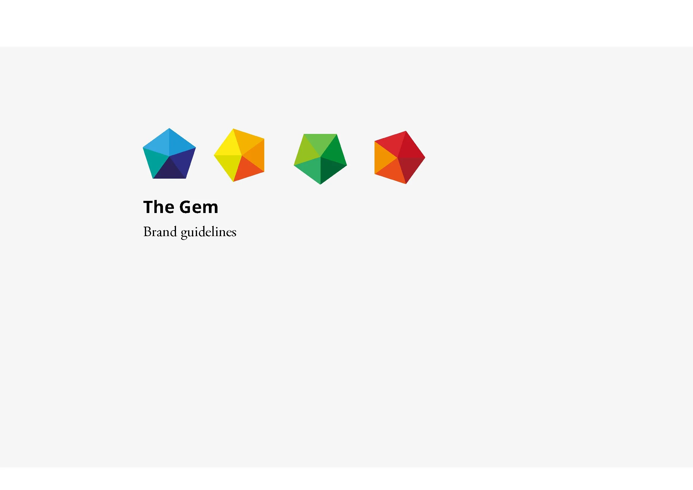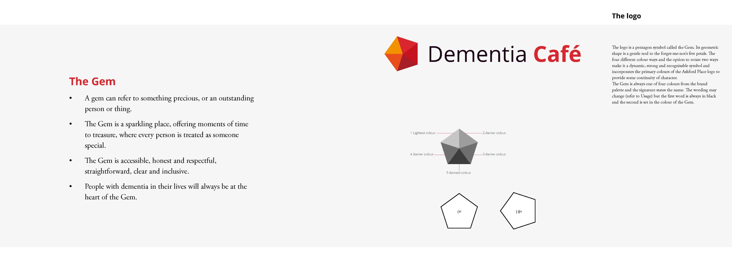
The Gem
‘Precious, something to treasure. People with dementia will always be at the centre of everything we do.’

A gemstones’ precious, sparkling quality perfectly symbolised the accessible, clear and inclusive environment a dementia charity wanted to achieve for its dementia friends.
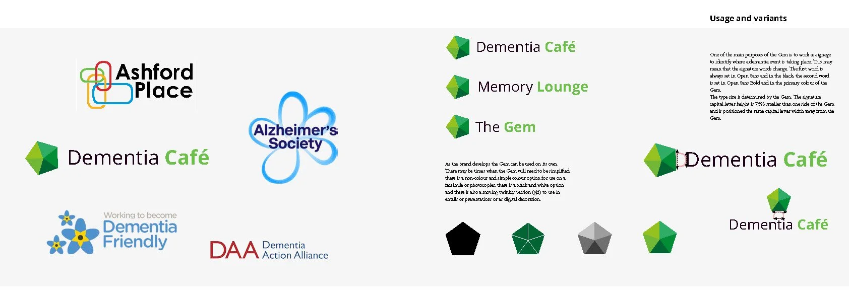
Ashford Place who are affiliated with Brent council, were looking for a new brand and specifically a symbol or logo to indicate where a dementia friendly event would take place; something that would be clear but inclusive and generally encourage the borough to be more dementia friendly.
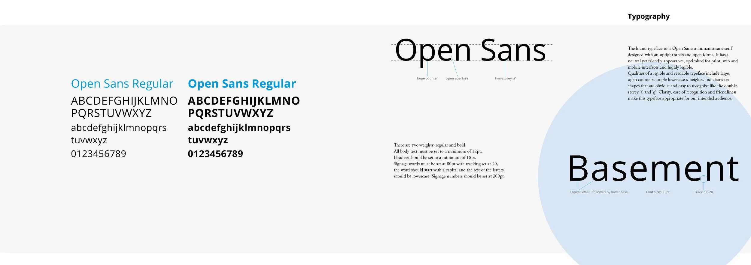
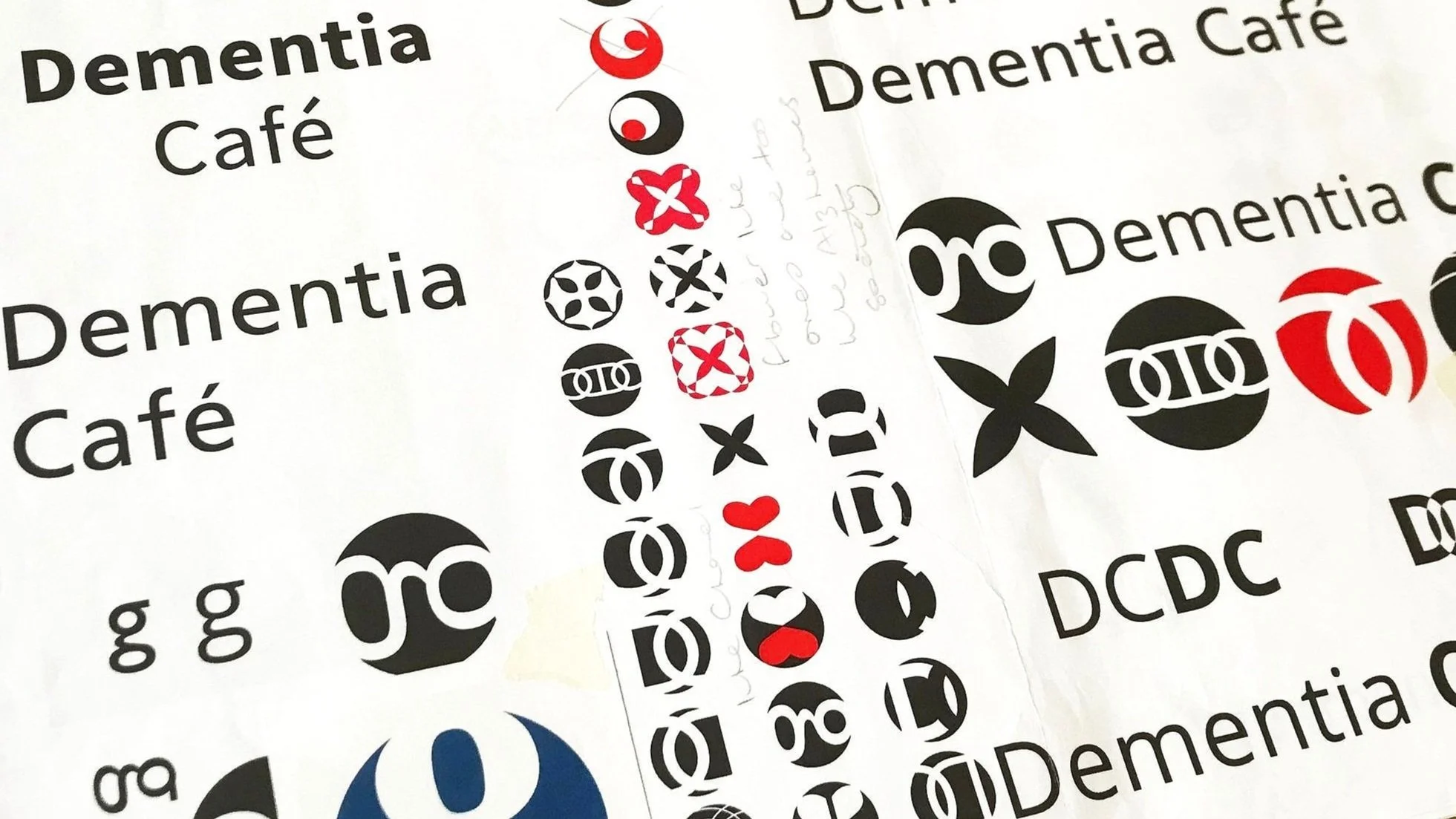
The first obvious step was to embark on identifying typefaces that would be appropriate for the charity and ensure that their communications would be accessible for their intended audience.
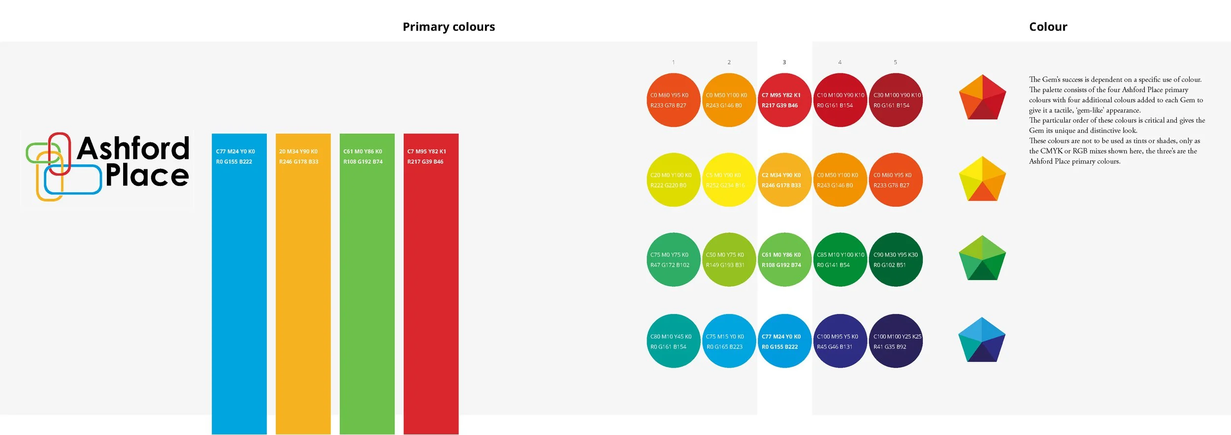
Colour was important (the Ashford Place colours needed to be referenced), the new logo would also have to sit next to other dementia charity logos. I developed a pentagon shape, colouring it in different ways and rotating to give it a tactile, gem-like appearance. The pentagon not only offered a gentle nod to the new Alzheimers Society 'forget-me-not', but its geometric shape also seemed like a good way to contrast as well as complement the other logos. 'The Gem' concept was worked into complete brand guidelines working with the legible typeface Open Sans.